Case Study
Ether.fi App
Ether.fi App
Ether.fi is a crypto-native financial platform that enables users to earn yield on digital assets, move money globally, and spend through real-world payment methods.
Ether.fi is a crypto-native financial platform that enables users to earn yield on digital assets, move money globally, and spend through real-world payment methods.
400K+
Active users who use the product
90K+
Activated Visa cards by users
43%
Send funds completion
31%
Support tickets reduction
MY ROLE
Primary Product Designer
TEAM
Head of Product, 14+ engineers, support, analytics, growth, compliance/legal
PLATFORM
Web app, iOS, Android, website
TIMELINE
~10 months
SCOPE
Add Funds, Send Funds, Convert, Vault, Cards, PIX, Earn, Liquid, Staking, Onboarding/KYC
OVERVIEW
A crypto-finance platform becoming everyday banking
A crypto-finance platform becoming everyday banking
When I joined, the product was expanding quickly across web and mobile. The platform already supported staking, yield, cards, crypto deposits, regional payment rails, and money movement - but many of these experiences had grown independently.
When I joined, the product was expanding quickly across web and mobile. The platform already supported staking, yield, cards, crypto deposits, regional payment rails, and money movement - but many of these experiences had grown independently.
My role was to simplify these complex financial flows into clearer product experiences across web, iOS, and Android.
My role was to simplify these complex financial flows into clearer product experiences across web, iOS, and Android.
$4B+
Total Value Locked
400K+
Registered users
90K+
Active Visa Cards
$3.7M+
Daily Spend Volume

PROBLEM
Complexity was breaking user confidence
Complexity was breaking user confidence
The platform had scaled faster than the experience. Users arrived expecting a simple financial app, but encountered staking, earning, crypto deposits, fiat rails, regional payment methods, and cross-border transfers all at once.
The platform had scaled faster than the experience. Users arrived expecting a simple financial app, but encountered staking, earning, crypto deposits, fiat rails, regional payment methods, and cross-border transfers all at once.
The biggest issues were:
The biggest issues were:
Users were asked to understand technical payment methods too early
Users were asked to understand technical payment methods too early
Fiat and crypto funding flows had different interaction patterns
Fiat and crypto funding flows had different interaction patterns
SEPA, ACH, SWIFT, PIX, and crypto deposits evolved independently
SEPA, ACH, SWIFT, PIX, and crypto deposits evolved independently
Status visibility and recovery states were not always clear
Status visibility and recovery states were not always clear
Users lost confidence when money movement felt silent or uncertain
Users lost confidence when money movement felt silent or uncertain
The problem was not only visual complexity. It was a mental model mismatch: users wanted to add money or send money, but the product exposed infrastructure-level decisions before giving enough context.
The problem was not only visual complexity. It was a mental model mismatch: users wanted to add money or send money, but the product exposed infrastructure-level decisions before giving enough context.
Known friction signals:
Known friction signals:
42%
42%
never finished KYC onboarding
never finished KYC onboarding
31%
31%
dropped off during payment method selection
dropped off during payment method selection
~124
~124
recurring support tickets/month
recurring support tickets/month
28%
28%
started Send/Add Funds but never confirmed
started Send/Add Funds but never confirmed

DISCOVERY
Finding where users lost confidence
Finding where users lost confidence
Because we didn’t have a dedicated UX researcher, I used a practical discovery process combining support insights, product analytics, competitor audits, and cross-functional reviews.
Because we didn’t have a dedicated UX researcher, I used a practical discovery process combining support insights, product analytics, competitor audits, and cross-functional reviews.
I looked at three main inputs:
I looked at three main inputs:
Customer support insights
Customer support insights
Recurring tickets showed confusion around payment methods, KYC failures, missing transaction status, and failed transfers without clear recovery paths.
Recurring tickets showed confusion around payment methods, KYC failures, missing transaction status, and failed transfers without clear recovery paths.
Amplitude funnel data
Amplitude funnel data
The largest abandonment point happened before users initiated a transfer - especially around funding method selection.
The largest abandonment point happened before users initiated a transfer - especially around funding method selection.
Competitive pattern audit
Competitive pattern audit
I reviewed fintech and crypto products to understand how others handled progressive disclosure, contextual education, status transitions, and recovery states.
I reviewed fintech and crypto products to understand how others handled progressive disclosure, contextual education, status transitions, and recovery states.
The key insight:
The key insight:
Users were not failing because they didn’t understand crypto. They were failing because the product asked them to make technical decisions before they understood the context.
Users were not failing because they didn’t understand crypto. They were failing because the product asked them to make technical decisions before they understood the context.


Strategy alignment workshop connecting user friction, product priorities, and success metrics before moving into UX exploration.
Strategy alignment workshop connecting user friction, product priorities, and success metrics before moving into UX exploration.

KEY INSIGHT
The issue was decision complexity
The issue was decision complexity
Users wanted to complete simple financial actions:
Add money
Send money
Convert funds
Earn yield
Stake assets
Understand what happened next
But the product exposed too many technical choices too early: payment rails, crypto networks, currencies, regions, wallet behavior, transfer methods, and destination requirements.
But the product exposed too many technical choices too early: payment rails, crypto networks, currencies, regions, wallet behavior, transfer methods, and destination requirements.
So the solution needed to reduce decision complexity through.
Clearer entry points
Progressive disclosure
Region-aware payment methods
Better status visibility
Clear confirmation and recovery states
Reusable patterns across fiat, crypto, and yield flows
EXPLORATION
Part 1 - Money Movement
Part 1 - Money Movement
Choosing the right architecture
Choosing the right architecture
Before moving into final UI, I explored multiple flow architectures for Add Funds and Send Funds.
Before moving into final UI, I explored multiple flow architectures for Add Funds and Send Funds.
For Add Funds, I explored:
For Add Funds, I explored:

For Send Funds, I explored:
For Send Funds, I explored:

I chose the final direction because it better matched how users think about money movement: who or what am I funding, where is it going, which currency is involved, and what methods are available in that context.
I chose the final direction because it better matched how users think about money movement: who or what am I funding, where is it going, which currency is involved, and what methods are available in that context.
ARCHITECTURE
Mapping complexity before simplifying it
Mapping complexity before simplifying it
Before designing the final screens, I mapped the full funding and transfer architecture.
Before designing the final screens, I mapped the full funding and transfer architecture.
This included:
This included:
Fiat funding paths, Crypto deposit paths, Regional payment rails, Currency availability, Transfer requirements, Failure states, Confirmation states, Recovery paths, Mobile and web differences
Fiat funding paths, Crypto deposit paths, Regional payment rails, Currency availability, Transfer requirements, Failure states, Confirmation states, Recovery paths, Mobile and web differences

SOLUTION
A modular funding and transfer system
A modular funding and transfer system
I designed a modular architecture for adding and sending funds across fiat, crypto, and regional payment methods.
I designed a modular architecture for adding and sending funds across fiat, crypto, and regional payment methods.
Add Funds flow
Send Funds flow
Designing PIX for Brazil
Designing PIX for Brazil
PIX was a strong example of designing for local payment behavior instead of forcing a generic Western banking model.
PIX was a strong example of designing for local payment behavior instead of forcing a generic Western banking model.
I designed two architecturally consistent flows:
I designed two architecturally consistent flows:
Add Funds: BRL → USDC
Pay with PIX: USDC → BRL
Add Funds: BRL → USDC
Pay with PIX: USDC → BRL
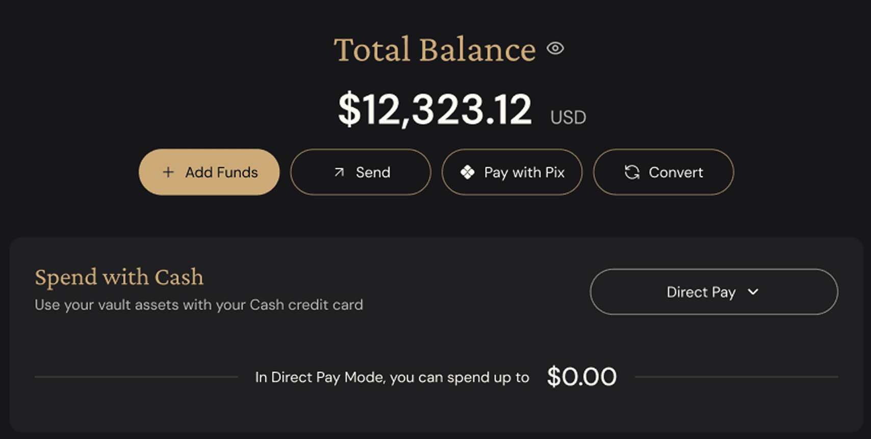


The goal was to make PIX feel native to Brazilian users while still fitting into ether.fi’s broader money movement architecture.
The goal was to make PIX feel native to Brazilian users while still fitting into ether.fi’s broader money movement architecture.
Outcome:
40K+
new Brazil users in first 90 days
EXPLORATION
Part 2 - Earn, Staking and Liquid products
Part 2 - Earn, Staking and Liquid products
Beyond money movement, I also redesigned key earning experiences across Earn, Liquid, and Staking. These products had strong value, but the old experience was dense, fragmented, and hard to compare — users had to understand tokens, APY, strategy vaults, staking actions, and positions without enough hierarchy.
Beyond money movement, I also redesigned key earning experiences across Earn, Liquid, and Staking. These products had strong value, but the old experience was dense, fragmented, and hard to compare — users had to understand tokens, APY, strategy vaults, staking actions, and positions without enough hierarchy.
Earn
Earn
Moved from asset discovery to clearer product comparison, with APY and decision-making information higher in the experience.
BEFORE

AFTER

Staking
Staking
Created a more guided staking experience with clearer balance, APY, action hierarchy, and transaction flow.
BEFORE

AFTER

Liquid
Liquid
Simplified strategy vaults by improving hierarchy around balance, APY, positions, activity, and available actions.
BEFORE

AFTER

IMPACT
A more connected financial ecosystem
A more connected financial ecosystem
The redesign helped turn fragmented crypto-finance flows into a more connected experience across funding, transfers, regional payments, earning, and staking.
The redesign helped turn fragmented crypto-finance flows into a more connected experience across funding, transfers, regional payments, earning, and staking.
Key outcomes:
Key outcomes:
40K+
Brazil users acquired through the PIX launch
43%
Send Funds completion after improving transfer architecture
30–40%
Reduction in recurring support tickets
31%
Add Funds friction addressed by simplifying funding method selection
Unified Add Funds and Send Funds architecture across fiat, crypto, and regional payment methods
Created clearer decision patterns for Earn, Liquid, and Staking experiences
Improved confidence through better status visibility, confirmation, and recovery states
WHAT I'D IMPROVE NEXT
Validate earlier, measure deeper
Validate earlier, measure deeper
If I continued improving this product area, I would focus on three things:
If I continued improving this product area, I would focus on three things:
Map the full architecture earlier
Map the full architecture earlier
Define the entire funding and transfer system before detailed UI exploration, so every flow is grounded in the same model from the beginning.
Define the entire funding and transfer system before detailed UI exploration, so every flow is grounded in the same model from the beginning.
Align success metrics earlier
Align success metrics earlier
Agree on measurable outcomes with product, analytics, support, and engineering before design starts, so every decision has a clearer validation path.
Agree on measurable outcomes with product, analytics, support, and engineering before design starts, so every decision has a clearer validation path.
Validate concepts sooner
Validate concepts sooner
Run lightweight usability checks with clickable prototypes before build, especially around trust, status visibility, and decision-making in high-risk financial flows.
Run lightweight usability checks with clickable prototypes before build, especially around trust, status visibility, and decision-making in high-risk financial flows.
Measure product confidence
Measure product confidence
Beyond completion rates, I’d track user confidence signals — where users hesitate, reopen details, contact support, or abandon before confirmation.
Beyond completion rates, I’d track user confidence signals — where users hesitate, reopen details, contact support, or abandon before confirmation.
Explore more case studies


LET'S CONNECT
Ready to build something great?
Ready to build something great?
Open to Product & UX/UI Designer roles, freelance projects, and meaningful collaboration. Let's talk about how great design can move your product forward.
Open to Product & UX/UI Designer roles, freelance projects, and meaningful collaboration. Let's talk about how great design can move your product forward.