Case Study
Design System
Design System
Design System
Unified a fragmented multi-platform product into one scalable design system across web, marketing, iOS, and Android - helping the team ship features faster.
Unified a fragmented multi-platform product into one scalable design system across web, marketing, iOS, and Android - helping the team ship features faster.
Unified a fragmented multi-platform product into one scalable design system across web, marketing, iOS, and Android - helping the team ship features faster.
MY ROLE
Product Designer / Leading the design system
COMPANY
Ether.fi — crypto-neobank bridging DeFi with everyday banking
PLATFORM
Web app, marketing website, iOS, Android
TIMELINE
v1 foundations in 7 weeks for web +marketing website, iOS/Android
OVERVIEW
A product outgrowing its system
A product outgrowing its system
Ether.fi is a crypto-neobank bridging DeFi with everyday banking. As the product expanded across the web app, marketing website, iOS, and Android, the team needed a stronger design foundation to support consistency, faster delivery, and more trustworthy financial experiences.
Ether.fi is a crypto-neobank bridging DeFi with everyday banking. As the product expanded across the web app, marketing website, iOS, and Android, the team needed a stronger design foundation to support consistency, faster delivery, and more trustworthy financial experiences.
Ether.fi is a crypto-neobank bridging DeFi with everyday banking. As the product expanded across the web app, marketing website, iOS, and Android, the team needed a stronger design foundation to support consistency, faster delivery, and more trustworthy financial experiences.
The design system mattered because ether.fi was scaling quickly across complex flows like onboarding, KYC, cards, payments, staking, vaults, transactions, and account management. Without a shared system, every new feature created more UI drift, more engineering ambiguity, and more inconsistency for users.
The design system mattered because ether.fi was scaling quickly across complex flows like onboarding, KYC, cards, payments, staking, vaults, transactions, and account management. Without a shared system, every new feature created more UI drift, more engineering ambiguity, and more inconsistency for users.
The design system mattered because ether.fi was scaling quickly across complex flows like onboarding, KYC, cards, payments, staking, vaults, transactions, and account management. Without a shared system, every new feature created more UI drift, more engineering ambiguity, and more inconsistency for users.
PROBLEM
Speed created inconsistency
Speed created inconsistency
The team was moving fast, but there was no consistent component list across web, iOS, Android, and the marketing website. No single source of truth existed, and no clear rule set defined how components should look, behave, or scale across platforms.
The team was moving fast, but there was no consistent component list across web, iOS, Android, and the marketing website. No single source of truth existed, and no clear rule set defined how components should look, behave, or scale across platforms.
The team was moving fast, but there was no consistent component list across web, iOS, Android, and the marketing website. No single source of truth existed, and no clear rule set defined how components should look, behave, or scale across platforms.
In practice, this meant engineers often rebuilt components from scratch because no one could say with confidence whether an existing pattern was correct. Brand identity existed at a high level, but it had not been translated into concrete product rules for every use case.
In practice, this meant engineers often rebuilt components from scratch because no one could say with confidence whether an existing pattern was correct. Brand identity existed at a high level, but it had not been translated into concrete product rules for every use case.
In practice, this meant engineers often rebuilt components from scratch because no one could say with confidence whether an existing pattern was correct. Brand identity existed at a high level, but it had not been translated into concrete product rules for every use case.
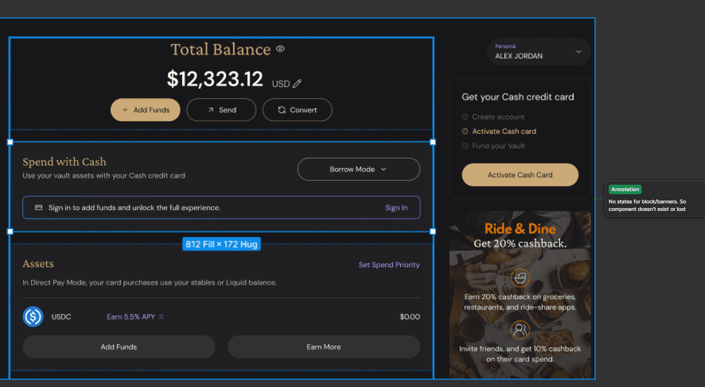
Missing states for key banners/blocks.
Missing states for key banners/blocks.

No auto layout for core screens.
No auto layout for core screens.

Different libraries, same component.
Different libraries, same component.

Mobile buttons came from different systems.
Mobile buttons came from different systems.
PROCESS
From weekly pain points to a v1 7-week system plan
From weekly pain points to a v1 7-week system plan
The process started with weekly discussions with the Head of Product and Lead Engineer. We reviewed the main pain points: inconsistent Figma components, no reliable source of truth, unclear cross-platform rules, and repeated engineering rework.
The process started with weekly discussions with the Head of Product and Lead Engineer. We reviewed the main pain points: inconsistent Figma components, no reliable source of truth, unclear cross-platform rules, and repeated engineering rework.
The process started with weekly discussions with the Head of Product and Lead Engineer. We reviewed the main pain points: inconsistent Figma components, no reliable source of truth, unclear cross-platform rules, and repeated engineering rework.
From there, I defined the problem areas and created a success plan in Notion for what the system needed to achieve:
From there, I defined the problem areas and created a success plan in Notion for what the system needed to achieve:
Create one source of truth across web, marketing, iOS, and Android in Figma
Reduce UI drift across product surfaces
Make component decisions reusable
Make the system practical enough for engineers to actually use
Create one source of truth across web, marketing, iOS, and Android in Figma
Reduce UI drift across product surfaces
Make component decisions reusable
Make the system practical enough for engineers to actually use
Create one source of truth across web, marketing, iOS, and Android in Figma
Reduce UI drift across product surfaces
Make component decisions reusable
Make the system practical enough for engineers to actually use
Define success criteria and expected outcomes
Audit existing Figma files and production screens
Use Figma + MCP + Claude Code to support audit and documentation
Define foundations, tokens, components, and platform rules
Validate key decisions with engineering
Document, review, and roll out the system
Define success criteria and expected outcomes
Audit existing Figma files and production screens
Use Figma + MCP + Claude Code to support audit and documentation
Define foundations, tokens, components, and platform rules
Validate key decisions with engineering
Document, review, and roll out the system
Define success criteria and expected outcomes
Audit existing Figma files and production screens
Use Figma + MCP + Claude Code to support audit and documentation
Define foundations, tokens, components, and platform rules
Validate key decisions with engineering
Document, review, and roll out the system


AI helped me move faster through the audit and documentation phase, but final design decisions were based on product context, platform constraints, engineering feedback, and user experience needs.
AI helped me move faster through the audit and documentation phase, but final design decisions were based on product context, platform constraints, engineering feedback, and user experience needs.
AUDIT
Finding the drift
Finding the drift
I audited the existing product screen by screen across the web app, marketing site, iOS, and Android. I catalogued repeated UI patterns and flagged areas where similar components were visually or technically inconsistent.
I audited the existing product screen by screen across the web app, marketing site, iOS, and Android. I catalogued repeated UI patterns and flagged areas where similar components were visually or technically inconsistent.
The audit covered:
The audit covered:
Buttons, inputs, and forms, Cards, Tables, Navigation, Modals, Tabs, Mobile components, Transaction rows, Asset cards, Empty states, Loading states, Error states, Marketing/product inconsistencies, Spacing, typography, color, and layout rules.
Buttons, inputs, and forms, Cards, Tables, Navigation, Modals, Tabs, Mobile components, Transaction rows, Asset cards, Empty states, Loading states, Error states, Marketing/product inconsistencies, Spacing, typography, color, and layout rules.


The goal was to understand what already existed, what was duplicated, what was missing, and which patterns needed to become canonical.
The goal was to understand what already existed, what was duplicated, what was missing, and which patterns needed to become canonical.

Using Figma MCP and Claude Code, I mapped recurring screen families across marketing, web app, and iOS to identify what already existed, what was incomplete, and what had to be rebuilt.
Using Figma MCP and Claude Code, I mapped recurring screen families across marketing, web app, and iOS to identify what already existed, what was incomplete, and what had to be rebuilt.

I used the audit to surface token drift across color, typography, spacing, radius, and elevation — highlighting duplicates, near-duplicates, odd values, and missing effect styles.
I used the audit to surface token drift across color, typography, spacing, radius, and elevation — highlighting duplicates, near-duplicates, odd values, and missing effect styles.
FOUNDATIONS
Creating the baseline
Creating the baseline
After the audit, I defined the core foundations of the system: colors, typography, spacing, radius, states, and reusable tokens.
After the audit, I defined the core foundations of the system: colors, typography, spacing, radius, states, and reusable tokens.
After the audit, I defined the core foundations of the system: colors, typography, spacing, radius, states, and reusable tokens.
Instead of treating the system as a static UI kit, I structured it around reusable design tokens so the brand could scale more consistently across platforms.
Instead of treating the system as a static UI kit, I structured it around reusable design tokens so the brand could scale more consistently across platforms.
Instead of treating the system as a static UI kit, I structured it around reusable design tokens so the brand could scale more consistently across platforms.
Foundations included:
Foundations included:
Color tokens, Typography scale, Spacing system, Radius rules, Component states, Responsive behavior, Accessibility basics, Platform rules for web, iOS, and Android
Color tokens, Typography scale, Spacing system, Radius rules, Component states, Responsive behavior, Accessibility basics, Platform rules for web, iOS, and Android

Dimensions / Typography / Breakpoints
Dimensions / Typography / Breakpoints

Semantic token
COMPONENTS
Reusable by default
Reusable by default
Once the foundations were clear, I built and organized the core component library in Figma. I prioritized the highest-use and highest-friction components first so teams could start adopting the system quickly.
Once the foundations were clear, I built and organized the core component library in Figma. I prioritized the highest-use and highest-friction components first so teams could start adopting the system quickly.
Once the foundations were clear, I built and organized the core component library in Figma. I prioritized the highest-use and highest-friction components first so teams could start adopting the system quickly.
Core components included:
Core components included:
Buttons, Inputs, Dropdowns, Cards, Tables, Modals, Navigation, Forms, Mobile components, Empty states, Loading states, Error states.
Buttons, Inputs, Dropdowns, Cards, Tables, Modals, Navigation, Forms, Mobile components, Empty states, Loading states, Error states.
Each component included variants, states, naming rules, and usage guidance. The goal was not only visual consistency, but making the correct pattern easier to find, reuse, and implement.
These are just an example:
Each component included variants, states, naming rules, and usage guidance. The goal was not only visual consistency, but making the correct pattern easier to find, reuse, and implement.
These are just an example:

Buttons
Buttons

Inputs
Inputs

PRODUCT PATTERNS
Beyond generic UI
Beyond generic UI
Generic UI components were not enough for ether.fi. The product needed reusable patterns for crypto-finance use cases where users make decisions involving identity, money, yield, rewards, and risk.
Generic UI components were not enough for ether.fi. The product needed reusable patterns for crypto-finance use cases where users make decisions involving identity, money, yield, rewards, and risk.
Product patterns included:
Transaction rows, Asset cards, Staking and vault flows, KYC states, Payment states, Card flows, Cashback and rewards patterns, Confirmation states, Empty, loading, and error states, Crypto-specific edge cases
Product patterns included:
Transaction rows, Asset cards, Staking and vault flows, KYC states, Payment states, Card flows, Cashback and rewards patterns, Confirmation states, Empty, loading, and error states, Crypto-specific edge cases
DOCUMENTATION & HANDOFF
Making it buildable
Making it buildable
The system had to be buildable, not just organized in Figma. I documented component behavior, usage rules, specs, variants, states, responsive behavior, and edge cases directly in the design system file.
The system had to be buildable, not just organized in Figma. I documented component behavior, usage rules, specs, variants, states, responsive behavior, and edge cases directly in the design system file.
I worked closely with engineers to align on:
Token naming
Component behavior
Platform constraints
Responsive rules
Edge cases
State logic
Implementation feasibility
How to extend patterns without creating new drift
I worked closely with engineers to align on:
Token naming
Component behavior
Platform constraints
Responsive rules
Edge cases
State logic
Implementation feasibility
How to extend patterns without creating new drift


IMPACT
Faster and more consistent
Faster and more consistent
The updated design system created a stronger foundation for scaling ether.fi across web, marketing, iOS, and Android.
The updated design system created a stronger foundation for scaling ether.fi across web, marketing, iOS, and Android.
Key outcomes:
Key outcomes:
Shipped a comprehensive design system across all four platforms
Shipped a comprehensive design system across all four platforms
Helped teams ship features approximately 40% faster
Helped teams ship features approximately 40% faster
Reduced fragmented UI patterns across product and marketing surfaces
Reduced fragmented UI patterns across product and marketing surfaces
Improved design and engineering alignment
Improved design and engineering alignment
Reduced ambiguity around components, specs, and implementation
Reduced ambiguity around components, specs, and implementation
Created reusable patterns for onboarding, KYC, cards, payments, staking, vaults, transactions, and account management
Created reusable patterns for onboarding, KYC, cards, payments, staking, vaults, transactions, and account management
Ran engineering workshops to support adoption
Ran engineering workshops to support adoption
The biggest impact was not just speed. The system helped create more clarity and trust across a complex crypto-finance product where every interaction needs to feel consistent, safe, and reliable.
The biggest impact was not just speed. The system helped create more clarity and trust across a complex crypto-finance product where every interaction needs to feel consistent, safe, and reliable.
WHAT I'D IMPROVE NEXT
System maturity
System maturity
If I continued evolving the system, I would focus on making it more connected to engineering and easier to govern at scale.
If I continued evolving the system, I would focus on making it more connected to engineering and easier to govern at scale.
Deeper Storybook sync
Stronger governance and contribution rules
Component usage tracking
Token automation between Figma and code
More accessibility documentation
Versioning and release notes
Clearer QA process for system adoption
Stronger measurement of time saved and implementation quality
Deeper Storybook sync
Stronger governance and contribution rules
Component usage tracking
Token automation between Figma and code
More accessibility documentation
Versioning and release notes
Clearer QA process for system adoption
Stronger measurement of time saved and implementation quality
LET'S CONNECT
Ready to build something great?
Ready to build something great?
Open to Product & UX/UI Designer roles, freelance projects, and meaningful collaboration. Let's talk about how great design can move your product forward.
Open to Product & UX/UI Designer roles, freelance projects, and meaningful collaboration. Let's talk about how great design can move your product forward.