CLass Admin Software, Web Platform, Event Management
ClassManager is a cloud-based web platform designed to simplify and automate class administration for small to mid-sized sports and activity clubs.
ClassManager is a cloud-based web platform designed to simplify and automate class administration for small to mid-sized sports and activity clubs.
ClassManager is a cloud-based web platform designed to simplify and automate class administration for small to mid-sized sports and activity clubs.
From dance studios to martial arts academies, ClassManager helps business owners manage bookings, scheduling, billing, and communication - all in one place.
As the Product Designer on the project from 2021 to 2022, I led the end-to-end UX/UI redesign of the platform, collaborating closely with cross-functional teams. My focus was to streamline user flows, redesign a bit UI, create a scalable design system, and reduce the friction that often plagues admin-heavy platforms.
MY ROLE
Product Designer
DURATION
From 2021 - 2022
TEAM
Backend Developers (3), QA Testers (2), Frontend Developers (2), CEO, Marketing Team.
SCOPE
Responsive UI, New onboarding experience, Components Library
INTRO
What ClassManager is and why it matters
What ClassManager is and why it matters
ClassManager is a cloud-based class administration platform built for small to mid-sized sports and activity clubs - including dance studios, swimming schools, gymnastics programs, and martial arts academies. It provides business owners with essential tools to manage bookings, scheduling, payments, staff, and communication in a single, centralized system.
ClassManager is a cloud-based class administration platform built for small to mid-sized sports and activity clubs - including dance studios, swimming schools, gymnastics programs, and martial arts academies. It provides business owners with essential tools to manage bookings, scheduling, payments, staff, and communication in a single, centralized system.
PROBLEM
Why the platform needed a redesign
Why the platform needed a redesign
Despite a solid business model, ClassManager was struggling with low user engagement and frequent support tickets. The platform had grown organically, but lacked UX coherence and visual consistency. Users often found onboarding confusing, class setup unintuitive, and day-to-day admin tasks time-consuming.
Despite a solid business model, ClassManager was struggling with low user engagement and frequent support tickets. The platform had grown organically, but lacked UX coherence and visual consistency. Users often found onboarding confusing, class setup unintuitive, and day-to-day admin tasks time-consuming.
Competitor platforms were either too expensive or too complex, leaving an opportunity for a solution that felt simple, affordable, and built for real-world workflows.
Competitor platforms were either too expensive or too complex, leaving an opportunity for a solution that felt simple, affordable, and built for real-world workflows.
GOAL
What we set out to fix
What we set out to fix
The goal was to transform ClassManager into a modern, user-centric platform that empowered small business owners to spend less time on admin and more time teaching.
The goal was to transform ClassManager into a modern, user-centric platform that empowered small business owners to spend less time on admin and more time teaching.
Specifically:
Reduce onboarding friction and setup time
Improve task flow clarity for managing classes, students, and billing
Build a consistent, scalable design system
Increase product adoption and reduce support requests
SOLUTION
How I redesigned the experience
How I redesigned the experience
I approached the redesign with a systems-thinking mindset - combining foundational UX improvements with modular UI development. I introduced a new onboarding flow with step-based progress tracking, created a component-based UI kit using Tailwind CSS and Vue.js, and simplified key flows like creating classes, managing students, and handling billing.
I approached the redesign with a systems-thinking mindset - combining foundational UX improvements with modular UI development. I introduced a new onboarding flow with step-based progress tracking, created a component-based UI kit using Tailwind CSS and Vue.js, and simplified key flows like creating classes, managing students, and handling billing.
And I focused on clear visual hierarchy, mobile responsiveness, and contextual guidance to improve usability across devices.
And I focused on clear visual hierarchy, mobile responsiveness, and contextual guidance to improve usability across devices.
RESULTS & OUTCOME
What changed after the redesign
What changed after the redesign
Users reported smoother navigation, less confusion, and a significant reduction in their day-to-day admin workload. ClassManager became an intuitive, business-friendly tool that felt like it was built for them - not against them.
Users reported smoother navigation, less confusion, and a significant reduction in their day-to-day admin workload. ClassManager became an intuitive, business-friendly tool that felt like it was built for them - not against them.
Here’s what we achieved together with our team:
74%
Faster task completion
65%
Increase in user engagement
40%
Reduction in support tickets
68%
Onboarding completion rate


PROCESS
How I uncovered what users truly needed
How I uncovered what users truly needed
To understand the real-world struggles users faced, I conducted qualitative interviews with instructors, administrators, and business owners who actively used ClassManager. These conversations revealed recurring patterns, including confusion around form logic, unclear navigation, and difficulty managing class capacity. I supplemented this with a usability audit and heuristic evaluation, which confirmed critical friction points. Additionally, I reviewed competitor platforms to identify best practices in calendar management, student profiles, and notification flows. These insights helped prioritize design goals and informed every decision in the following stages.
To understand the real-world struggles users faced, I conducted qualitative interviews with instructors, administrators, and business owners who actively used ClassManager. These conversations revealed recurring patterns, including confusion around form logic, unclear navigation, and difficulty managing class capacity. I supplemented this with a usability audit and heuristic evaluation, which confirmed critical friction points. Additionally, I reviewed competitor platforms to identify best practices in calendar management, student profiles, and notification flows. These insights helped prioritize design goals and informed every decision in the following stages.
COMPETITIVE RESEARCH
What the market was missing
What the market was missing
During this phase, I compared ClassManager to competitors like Mindbody, Brightwheel, and Jackrabbit Dance. Most tools were either overpriced or overloaded with features irrelevant to small businesses. Very few were mobile-optimized or automated. These gaps helped me identify an opportunity to build a lightweight, affordable, and focused solution that put user needs first.
During this phase, I compared ClassManager to competitors like Mindbody, Brightwheel, and Jackrabbit Dance. Most tools were either overpriced or overloaded with features irrelevant to small businesses. Very few were mobile-optimized or automated. These gaps helped me identify an opportunity to build a lightweight, affordable, and focused solution that put user needs first.

From this research, I defined key focus areas for ClassManager: simplicity, affordability, and automation. The ClassManager positioned the platform as an intuitive, cost-effective solution that provided the essential tools for class-based businesses – without unnecessary complexity.
From this research, I defined key focus areas for ClassManager: simplicity, affordability, and automation. The ClassManager positioned the platform as an intuitive, cost-effective solution that provided the essential tools for class-based businesses – without unnecessary complexity.
USER PERSONA
Who we were designing for
Who we were designing for
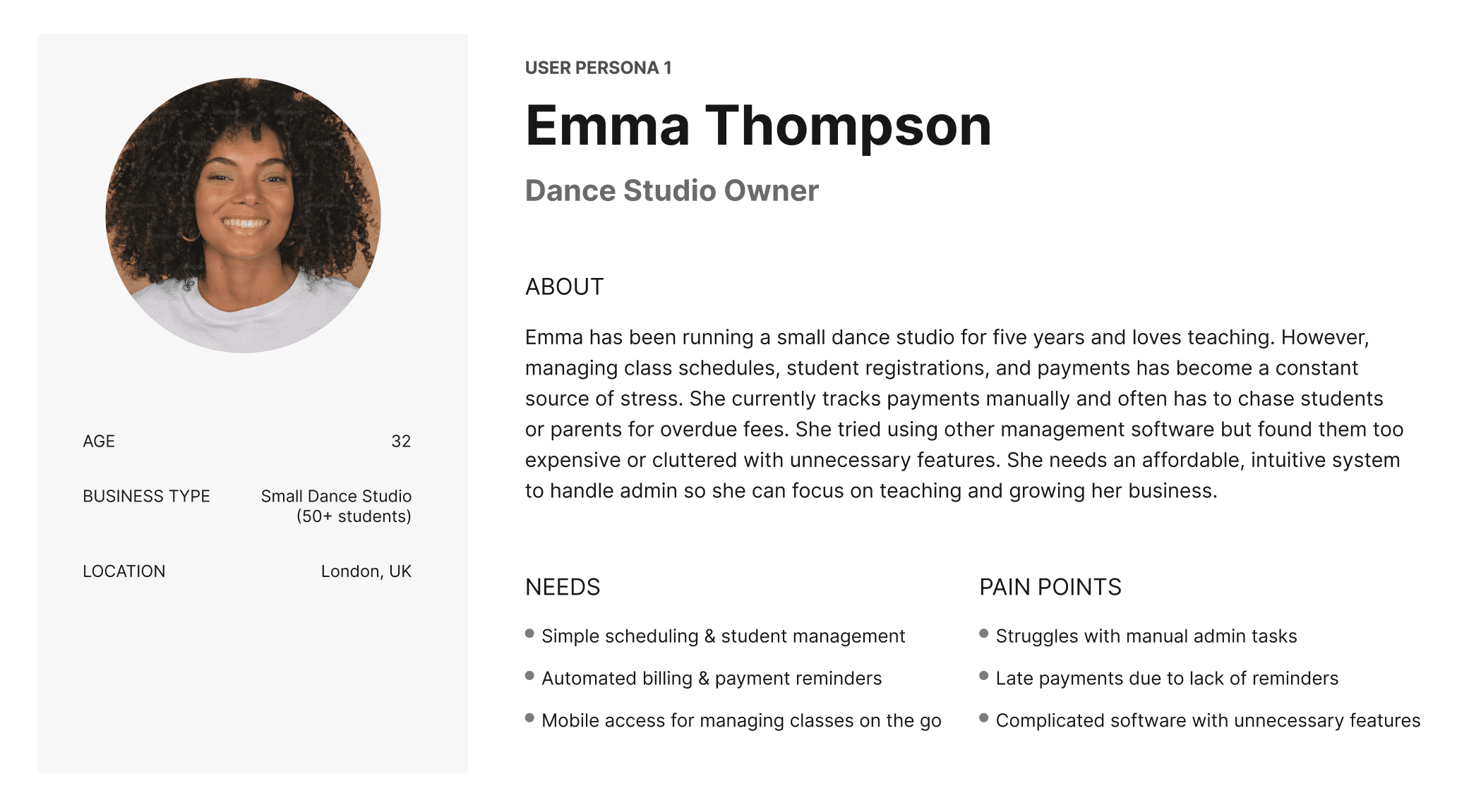
I created detailed personas to represent our core users. Emma, a dance studio owner, was overwhelmed by constant admin tasks. Mark, a martial arts instructor, struggled with managing classes across venues. Sarah, who ran a swim school, constantly dealt with parent communication and disorganized scheduling. These personas helped ensure we addressed real-world pain points, not imagined ones.
I created detailed personas to represent our core users. Emma, a dance studio owner, was overwhelmed by constant admin tasks. Mark, a martial arts instructor, struggled with managing classes across venues. Sarah, who ran a swim school, constantly dealt with parent communication and disorganized scheduling. These personas helped ensure we addressed real-world pain points, not imagined ones.


USER JOURNEY MAP
Where the friction was happening
Where the friction was happening
Mapping out Emma’s full user journey revealed a system full of friction: from late-night manual reminders to missed payments and last-minute cancellations. She had tried switching to other platforms but found them either too expensive or too complex. This journey map helped us prioritize automation, mobile access, and simplification.
Mapping out Emma’s full user journey revealed a system full of friction: from late-night manual reminders to missed payments and last-minute cancellations. She had tried switching to other platforms but found them either too expensive or too complex. This journey map helped us prioritize automation, mobile access, and simplification.

DESIGN & PROTOTYPING
How I reshaped the core flows
How I reshaped the core flows
I started by simplifying core flows like onboarding, class creation, and payment management. I used progressive disclosure, reduced cognitive load, and introduced visual hierarchy so users could focus on one step at a time. The new structure gave users confidence, speed, and clarity, resulting in fewer errors and faster workflows.
I started by simplifying core flows like onboarding, class creation, and payment management. I used progressive disclosure, reduced cognitive load, and introduced visual hierarchy so users could focus on one step at a time. The new structure gave users confidence, speed, and clarity, resulting in fewer errors and faster workflows.
DESIGN & RESULTS
Guiding new users with confidence
Guiding new users with confidence
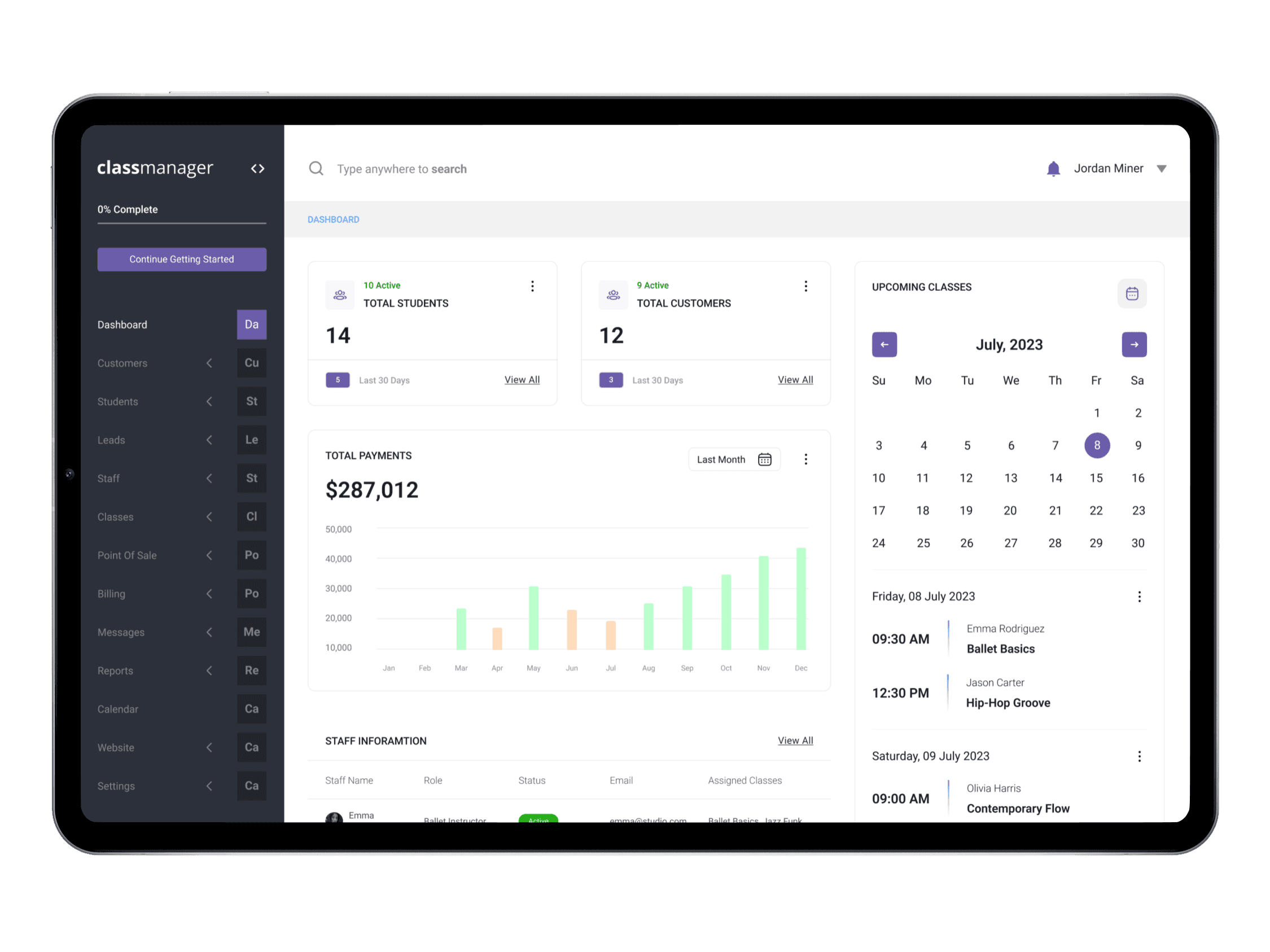
This is the Onboarding Dashboard, I designed to guide new users through essential setup steps efficiently. The onboarding system provides a structured, step-by-step checklist, ensuring users complete key tasks like adding customers, linking students, setting up venues, and managing billing.
This is the Onboarding Dashboard, I designed to guide new users through essential setup steps efficiently. The onboarding system provides a structured, step-by-step checklist, ensuring users complete key tasks like adding customers, linking students, setting up venues, and managing billing.
Progress Bar (Top Left)
Displays onboarding completion percentage, motivating users to finish setup.
Task-Based Sections
Divides onboarding into Company Profile, Customers, Students, Staff, Venues, Classes, and Billing, ensuring a guided experience.
Call-to-Action Buttons (Get Started)
Encourages engagement with an intuitive action-based approach.

DESIGN & RESULTS
Simplifying setup for businesses and clients
Simplifying setup for businesses and clients
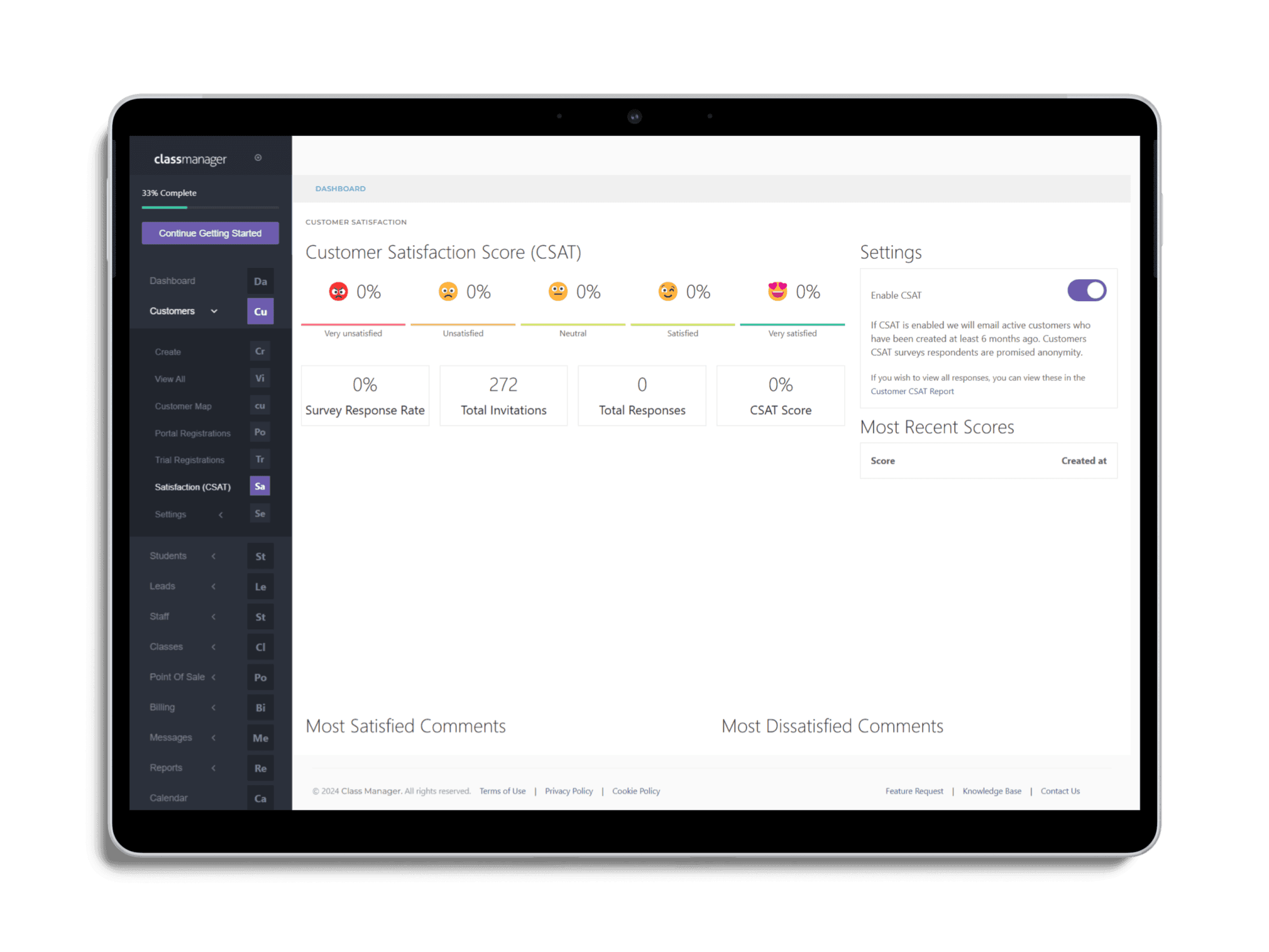
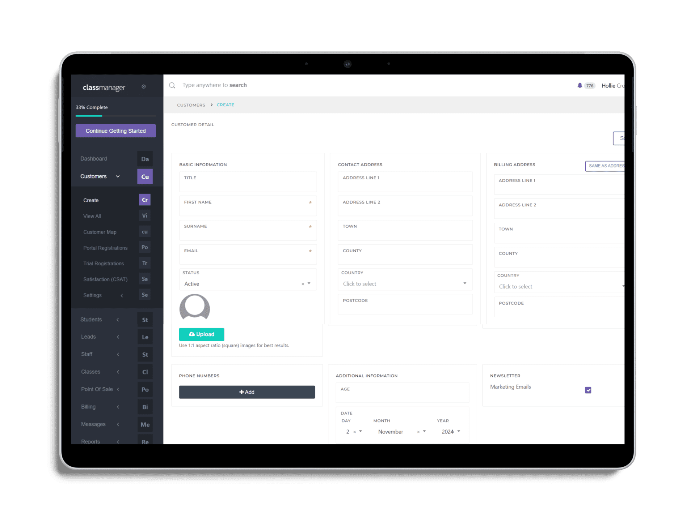
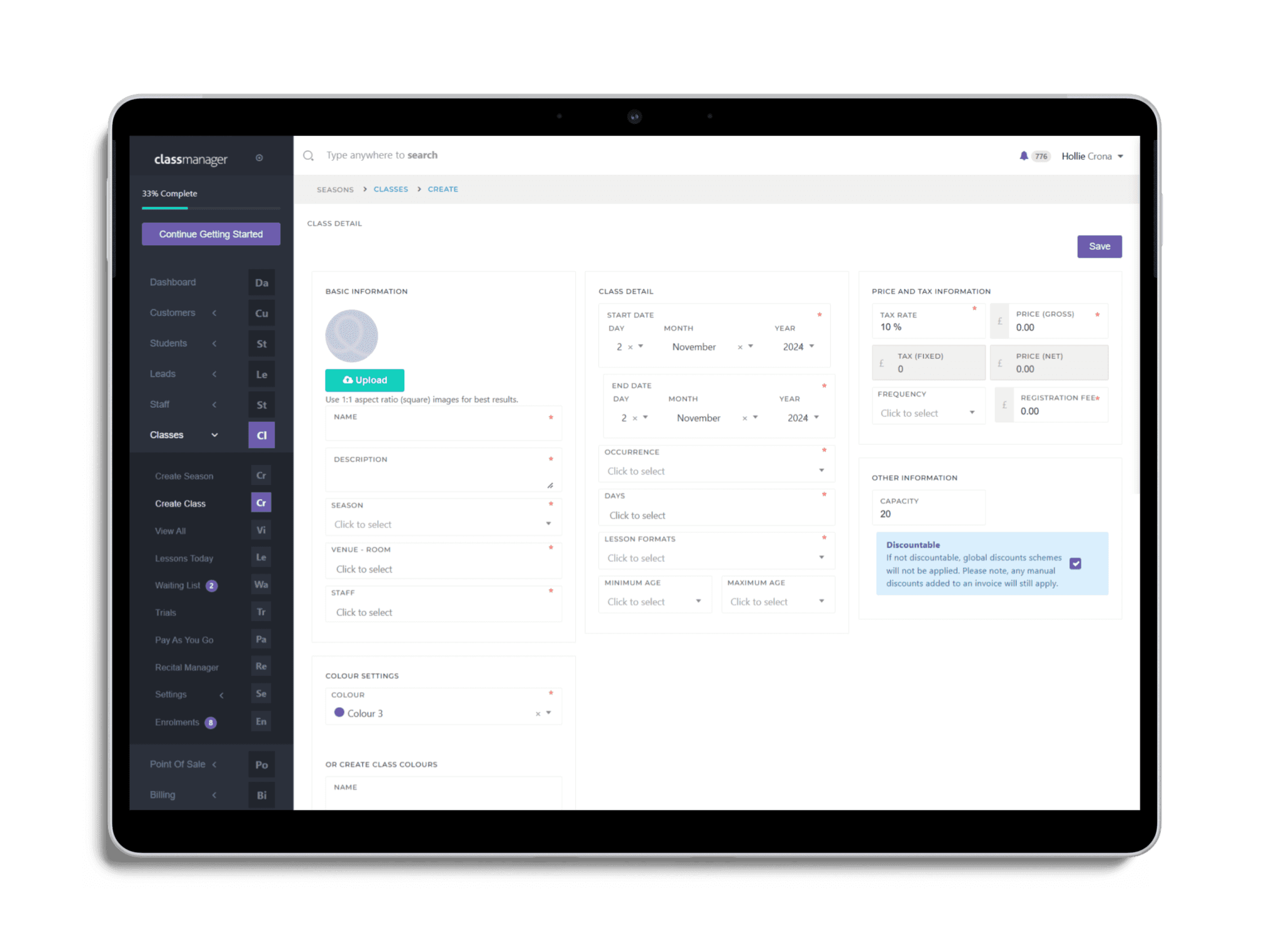
I redesigned the company and client profile setup flows to be more intuitive. Fewer steps, smart defaults, and inline validation reduced friction. These changes helped users complete setup faster and with fewer mistakes. Video walkthroughs and tooltips reinforced confidence and gave users flexibility to return to unfinished steps.
I redesigned the company and client profile setup flows to be more intuitive. Fewer steps, smart defaults, and inline validation reduced friction. These changes helped users complete setup faster and with fewer mistakes. Video walkthroughs and tooltips reinforced confidence and gave users flexibility to return to unfinished steps.
Creating Customer Profile
Creating Company Profile
DESIGN SYSTEM
Creating a scalable, unified UIKit
Creating a scalable, unified UIKit
I noticed the lack of consistency in UI elements was making navigation confusing and slowing down development. Buttons, forms, and layouts were inconsistent, leading to design inefficiencies and fragmented user experiences.
I noticed the lack of consistency in UI elements was making navigation confusing and slowing down development. Buttons, forms, and layouts were inconsistent, leading to design inefficiencies and fragmented user experiences.
To solve this, I built a scalable UI Kit, deeply integrating Tailwind CSS and Vue.js components to ensure a modular, reusable design system. This provided a unified structure with consistent typography, color palettes, and interactive elements, allowing for faster development, smoother handoffs, and a seamless user experience across web and mobile.
To solve this, I built a scalable UI Kit, deeply integrating Tailwind CSS and Vue.js components to ensure a modular, reusable design system. This provided a unified structure with consistent typography, color palettes, and interactive elements, allowing for faster development, smoother handoffs, and a seamless user experience across web and mobile.

COMPONENTS
Engineering design into every detail
Engineering design into every detail
Working with the dev team, I helped build a reusable component library in Vue.js and Laravel. This ensured every UI element was modular and maintainable, supporting both custom feature rollouts and rapid iteration. It also enabled us to keep shipping updates without sacrificing consistency or performance.
Working with the dev team, I helped build a reusable component library in Vue.js and Laravel. This ensured every UI element was modular and maintainable, supporting both custom feature rollouts and rapid iteration. It also enabled us to keep shipping updates without sacrificing consistency or performance.


FEEDBACK
What our users had to say
What our users had to say
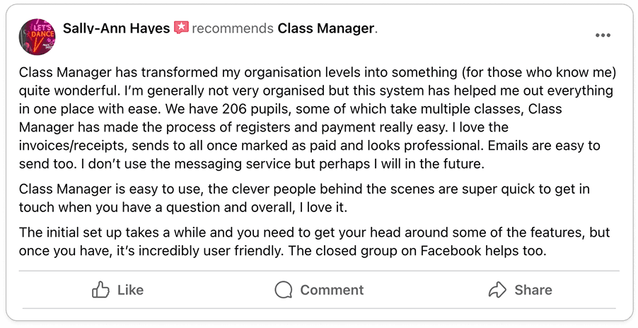
After redesigning ClassManager, the impact was immediate – business owners who once struggled with clunky workflows and time-consuming admin tasks now found the platform effortless and intuitive. Users shared how scheduling, invoicing, and enrolling students, which used to be a hassle, became smooth and efficient, cutting their admin time in half. The frustration of navigating complex interfaces was replaced with a user-friendly experience that allowed them to focus on what truly mattered – teaching and growing their business.
After redesigning ClassManager, the impact was immediate – business owners who once struggled with clunky workflows and time-consuming admin tasks now found the platform effortless and intuitive. Users shared how scheduling, invoicing, and enrolling students, which used to be a hassle, became smooth and efficient, cutting their admin time in half. The frustration of navigating complex interfaces was replaced with a user-friendly experience that allowed them to focus on what truly mattered – teaching and growing their business.
Many expressed how they wished they had switched to ClassManager sooner, highlighting how the new automation features and improved navigation made everyday operations easier. Support tickets dropped as users could now intuitively manage their studios without confusion. With a system that was finally built for them, not against them, business owners could run their operations with confidence, knowing everything just worked.
Many expressed how they wished they had switched to ClassManager sooner, highlighting how the new automation features and improved navigation made everyday operations easier. Support tickets dropped as users could now intuitively manage their studios without confusion. With a system that was finally built for them, not against them, business owners could run their operations with confidence, knowing everything just worked.


LESSONS
Key takeaways from the journey
Key takeaways from the journey
One of the most valuable takeaways from this project was the impact of direct user feedback at every stage. Talking to actual users early on helped uncover not just interface problems, but also business logic gaps that weren’t initially apparent. I also learned the importance of collaboration with developers during the prototyping phase, small layout decisions sometimes needed adjustment based on engineering constraints, and early communication helped avoid costly rework.
One of the most valuable takeaways from this project was the impact of direct user feedback at every stage. Talking to actual users early on helped uncover not just interface problems, but also business logic gaps that weren’t initially apparent. I also learned the importance of collaboration with developers during the prototyping phase, small layout decisions sometimes needed adjustment based on engineering constraints, and early communication helped avoid costly rework.
NEXT STEPS
Where I’d take the product from here
Where I’d take the product from here
With the success of the redesign and positive user feedback, the next phase focused on refining the experience and expanding capabilities. In the short term, we addressed minor UI tweaks, optimized system performance, and resolved lingering bugs to ensure a seamless experience. As user engagement grew, we prioritized feature enhancements like automated reminders, improved reporting, and a more personalized onboarding experience to further reduce admin time for business owners.
With the success of the redesign and positive user feedback, the next phase focused on refining the experience and expanding capabilities. In the short term, we addressed minor UI tweaks, optimized system performance, and resolved lingering bugs to ensure a seamless experience. As user engagement grew, we prioritized feature enhancements like automated reminders, improved reporting, and a more personalized onboarding experience to further reduce admin time for business owners.
Looking ahead, our long-term vision aimed to scale ClassManager into new markets and user segments, exploring AI-powered automation, deeper integrations with third-party tools, and a mobile-first strategy to support on-the-go management. To sustain growth, we planned to continuously test and refine the platform, ensuring that each update aligned with business goals and real user needs.
Looking ahead, our long-term vision aimed to scale ClassManager into new markets and user segments, exploring AI-powered automation, deeper integrations with third-party tools, and a mobile-first strategy to support on-the-go management. To sustain growth, we planned to continuously test and refine the platform, ensuring that each update aligned with business goals and real user needs.
Explore more case studies


CASE STUDIES
Roam Mobile App
Class Manager
Stage Stubs
OLEKSII TATARKO
MENTORSHIP
CASE STUDIES
Roam Mobile App
Class Manager
Stage Stubs
OLEKSII TATARKO
MENTORSHIP
CASE STUDIES
Roam Mobile App
Class Manager
Stage Stubs
OLEKSII TATARKO
MENTORSHIP
CASE STUDIES
Roam Mobile App
Class Manager
Stage Stubs
OLEKSII TATARKO
MENTORSHIP